Java Reference
In-Depth Information
Customizing a JToolTip Look and Feel
Each installable Swing look and feel provides a different
JToolTip
appearance and a set of
default
UIResource
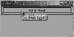
value settings. Figure 4-5 shows the appearance of the
JToolTip
component
for the preinstalled set of look and feel types: Motif, Windows, and Ocean.
Motif
Windows
Ocean
Figure 4-5.
JToolTip under different look and feel types
The available set of
UIResource
-related properties for a
JToolTip
is shown in Table 4-6.
For the
JToolTip
component, there are nine different properties.
Table 4-6.
JToolTip UIResource Elements
Property String
Object Type
ToolTip.background
Color
ToolTip.backgroundInactive
Color
ToolTip.border
Border
ToolTip.borderInactive
Color
ToolTip.font
Font
ToolTip.foreground
Color
ToolTip.foregroundInactive
Color
ToolTip.hideAccelerator
Boolean
ToolTipUI
String
As noted earlier in this chapter, the
JToolTip
class supports the display of arbitrary HTML
content. This permits the display of multiple-column and multiple-row input.
ToolTipManager Class
Although the
JToolTip
is something of a passive object, in the sense that the
JComponent
creates
and shows the
JToolTip
on its own, there are many more configurable aspects of its usage.
However, these configurable aspects are the responsibility of the class that manages tooltips,
not the
JToolTip
itself. The class that manages tooltip usage is aptly named
ToolTipManager
.
With the Singleton design pattern, no constructor for
ToolTipManager
exists. Instead, you have
access to the current manager through the static
sharedInstance()
method of
ToolTipManager
.