Information Technology Reference
In-Depth Information
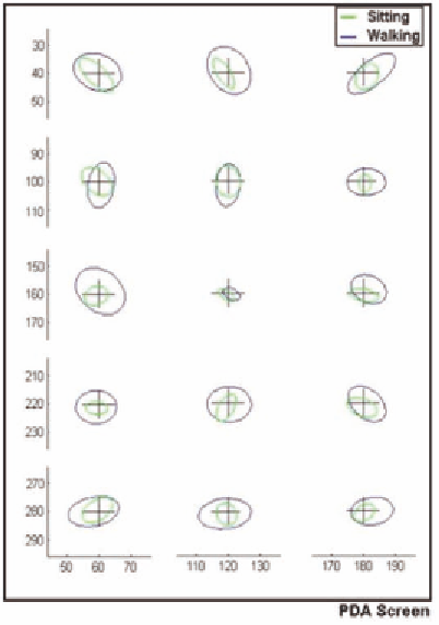
Figure 9. Ellipses show 2 standard deviations
of a Gaussian fit to the spread of mean tap posi-
tions (from 4 points per participant) from all 20
participants, for each target. In each case the
smaller ellipse shows the results for the seated
condition and the larger ellipse shows the results
for the walking condition. The crosses represent
the target positions.
arm as it moves upwards to its peak, and bins 6
to 10 correspond to the arm moving downwards.
A bias in clearly shown towards tapping in the
second half of the oscillation. This bias is not
present when analysing the phase at which the
targets are displayed and must therefore have been
introduced by the user. The phases when most
taps occur correspond to when the device is mov-
ing downwards with the arm. As soon as the device
begins to move upwards in the hand again towards
the stylus, the number of taps on the screen de-
creases. When questioned after the experiment,
none of the participants was aware that a bias
existed.
Figure 11 shows the median of the mean mag-
nitude tap error for each participant, for each of
the step phase bins above. This figure shows that
users were more accurate when tapping in the
second half of the phase - the time when most taps
occurred. The mean error is 7.1 pixels in the first
section (just when the arm starts to rise again),
compared to a mean of 5.6 pixels in the fourth
section when the hand is moving downwards.
Further to this, if we consider just the three
most probable tap phase bins (P
HP
) and the three
least tap probable tap phase bins (P
LP
) a clearer
indication of this is given. Figure 12 shows a box
plot of the tap error in P
HP
and P
LP
. P
HP
has me-
dian tap error of 4.6 pixels compared to 5.7 pixels
for P
LP
. A Mann Whitney test showed that this
difference was highly significant (p < 0.002). If
we consider the timing data for the same phase
regions, it can be seen that users take signifi-
cantly longer to tap in the high probability regions.
Users took a median of 0.69 seconds to tap in P
LP
compared to 0.73 seconds for P
HP
. This difference
was again tested using a Mann Whitney test and
was shown to be significant (p = 0.05). Figure 13
shows the corresponding skew plot for high and
low tap probability regions.
When combined with the results shown in
Figure 10 above, these data suggest that users
were able to subconsciously alter their behaviour
in the task in order to improve their accuracy by
Instrumented Usability Analysis
Results
Tap Phase
The method for obtaining the phase of step that
the tap occurred at is described above. Figure 10
splits one step into 10 equal sections and plots
the median of the number of taps in each section
for each participant. The reset phase position
corresponds to the lowest point of the vertical
accelerometer trace. Bins 1 to 5 correspond to the
Search WWH ::

Custom Search