HTML and CSS Reference
In-Depth Information
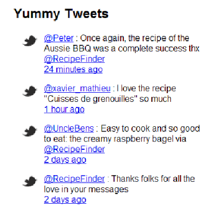
Figure 2.7. Our Yummy Tweets after adding the Twitter icons using pseudo-elements
Adding the pseudo-element using absolute positioning is just one step towards styling this
area. Overall, our website still needs a lot of styling, as does the Yummy Tweets section.
What about Responsive Web Design?
One of the biggest trends in the web design industry right now is Responsive Web Design
(RWD). This topic is an introduction to CSS, so we won't be covering that particular tech-
nique in exhaustive detail; however, I will introduce the topic here, and in
Chapter 5
we'll
use responsive design techniques to complete the coding of RecipeFinder.
So what exactly is responsive design? Briefly, it involves coding the CSS in such a way that
it ensures the width of the website and its content adapt to the size of the user's browser
window. This means if the user visits on a desktop PC browser at 1920x1080 resolution or a
cellphone at 320x480, the content and layout will adjust to fit.
RWD is centered on the use of media queries, a CSS feature that we haven't discussed yet.
Let's take a quick look at the syntax for media queries so you can see how they can be used
to build a responsive web design: