HTML and CSS Reference
In-Depth Information
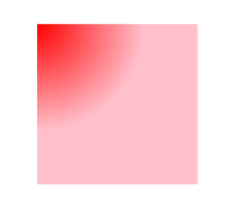
.example {
width: 300px;
height: 300px;
background-image: radial-gradient(circle 200px at top
left,
↵
red, pink);
}
A gradient with those specifications would look something like
Figure 5.13
.
Figure 5.13. A radial gradient with a custom shape, size, and position
Compare what you see in
Figure 5.13
with the code in the previous code block. In the code,
we defined the shape of the gradient as “
circle
” and sized it at 200px. We also specified
that it should be placed in the top-left corner of the element.
Figure 5.13
shows the circular
area of the gradient with its center in the top left of the element.
As mentioned, we won't cover all the details for the radial gradient syntax here. Just recog-
nize that for both linear and radial gradients, we have the ability to include some of these
options prior to the defining of the color stops. Basically, the browser will look at everything
that appears before the first comma and try to interpret it as a color. If it's not a valid color
(hex, RGB, etc.), then it will try to interpret it as a direction (for linear gradients), or a direc-
tion, position, size, etc. (for radial gradients).