HTML and CSS Reference
In-Depth Information
left: 15px;
top: 4px;
transition: transform .5s linear;
}
.tweet:hover:before {
transform: rotate(360deg);
}
This expands on our existing
.tweet
styles, adding a transition declaration to our
:be-
fore
pseudo-element, along with a new declaration block. The new declaration block uses
something we haven't yet seen: two pseudo-selectors combined. In this case, we're telling
the browser to rotate the :before pseudo-element element 360 degrees clockwise when the
user hovers their mouse anywhere over a
.tweet
element (which contains the
:before
element).
Linear Gradients
The features described in this section will help us complete the overall look of RecipeFinder.
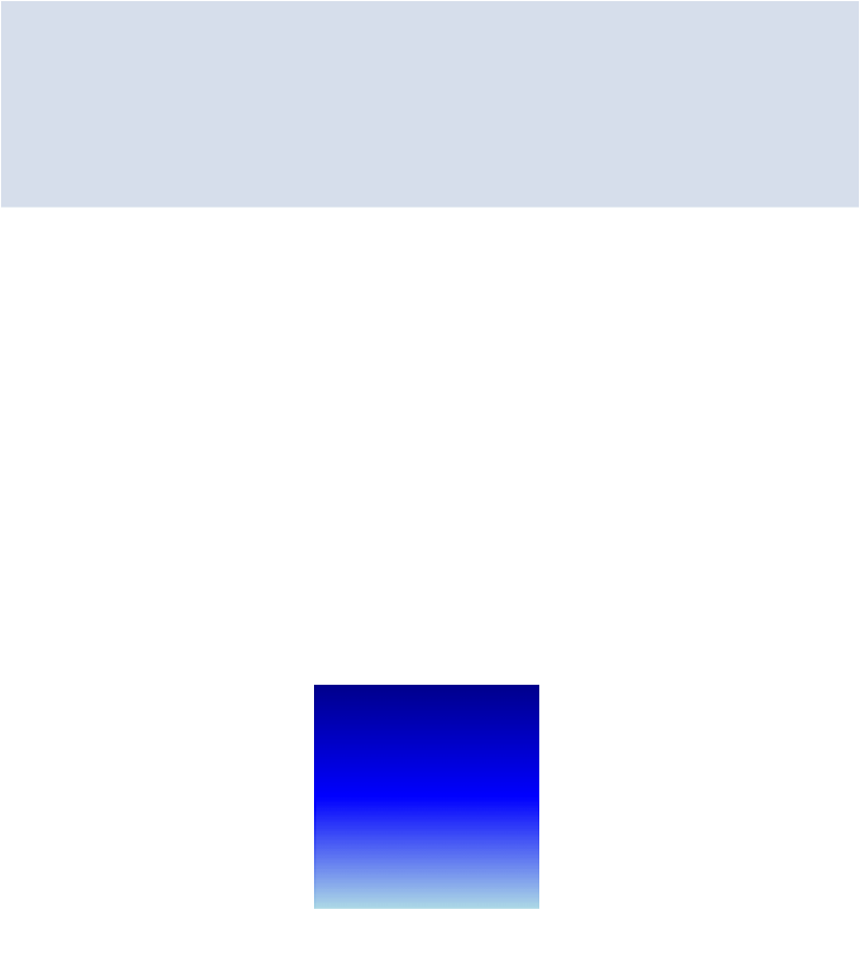
CSS allows us to define graphics called
gradients
, without using images. A gradient is a stat-
ic image that consists of two or more colors, where one is gradually changing into the other.
Figure 5.5
shows what a basic gradient looks like.
Figure 5.5. A simple example of a gradient