Information Technology Reference
In-Depth Information
the bottom of the fourth box are
that can increase the chance of correctly detecting
possible intrusion without generating false alarm on normal attacks.
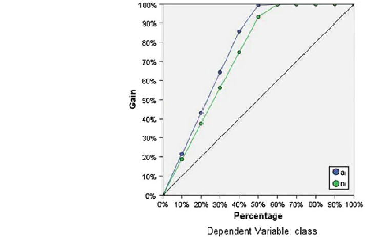
In the Fig.
11
cumulative gains chart demonstrates the percentage of the overall
number of cases in a given category
—
“
gained
”
by targeting a percentage of the total
number of cases. For example, the
first point on the curve for the anomaly category
is at (10, 20 %), meaning that if a dataset is scored with the network and sort all of
the cases by predicted pseudo-probability of anomaly, it is expected that the top
10 % to contain approximately 20 % of all of the cases that actually take the
category anomaly (attacks). Likewise, the top 20 % would contain approximately
45 % of the anomaly; the top 30 % of cases would contain 65 % of defaulters, and
so on. If 100 % scored dataset is selected then all of the anomaly in the dataset will
be obtained. The diagonal line is the
“
baseline
”
curve; if 10 % of scored dataset is
selected at random, then it is expected to
approximately 10 % of all of the
cases that actually take the category anomaly. The farther above the baseline a
curve lies, the greater the gain. The cumulative gains chart is used to help choose a
classi
“
gain
”
cation cutoff by choosing a percentage that corresponds to a desirable gain,
and then mapping that percentage to the appropriate cutoff value. What constitutes a
“
”
gain depends on the cost of Type I and Type II errors. That is, what is
the cost of classifying a anomaly attack as a normal attack (Type I)? What is the
cost of classifying a normal as a anomaly (Type II)? If any network parameter is the
primary concern, then Type I error may be minimised; on the cumulative gains
chart, this might correspond to generate alarm in the top 40 % of pseudo-predicted
probability of anomaly, which captures nearly 90 % of the possible anomaly attacks
desirable
Fig. 11 Cumulative gains
chart, dependent variable:
class
Search WWH ::

Custom Search