Geoscience Reference
In-Depth Information
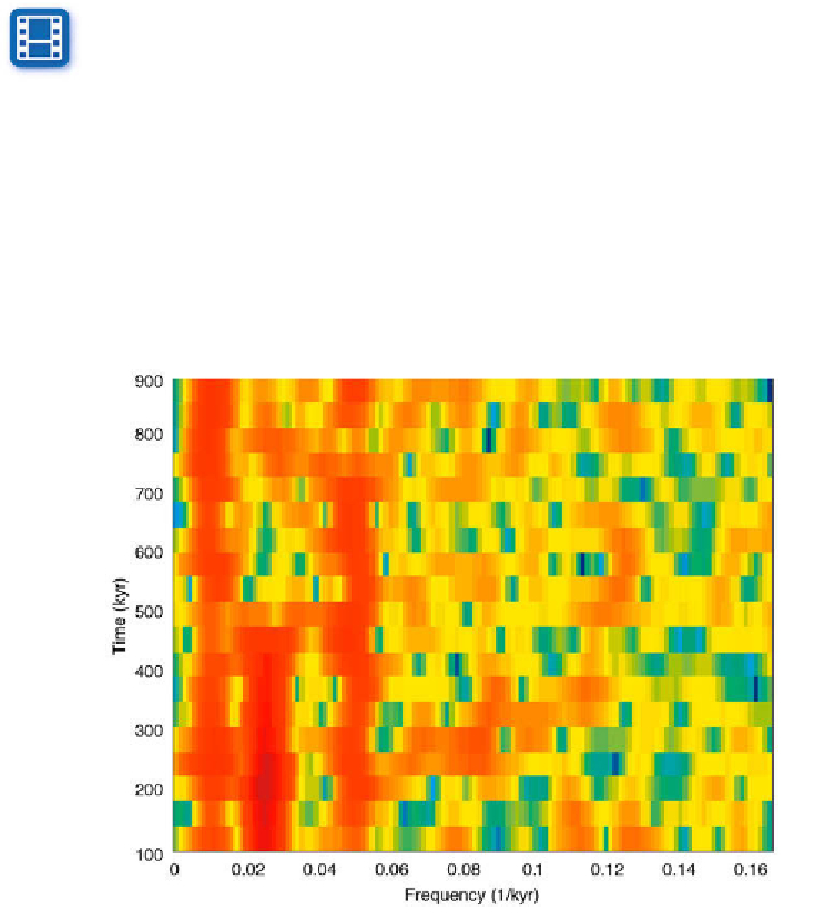
h e output from
spectrogram
is a color plot (Fig. 5.13) that displays red ver-
tical stripes representing signii cant maxima at frequencies of 0.01 and 0.05
kyr
-1
(i.e., every 100 and 20 kyrs). h ere is also a 40 kyr cycle (corresponding
to a frequency of 0.025 kyr
-1
), but this only occurs at er ca. 450 kyrs, as
documented by the vertical red stripe in the lower half of the graph.
To improve the visibility of the signii cant cycles, the colors used in the
graph can be modii ed using the colormap editor.
Movie
5.2
colormapeditor
h e colormap editor displays the colormap of the i gure as a strip of
rectangular cells. h e nodes that separate regions of uniform slope in the RGB
colormap can be shit ed by using the mouse, which introduces distortions
in the colormap and results in modii cation of the spectrogram colors. For
example shit ing the yellow node towards the right increases the contrast
between the vertical peak areas at 100, 40 and 20 kyrs, and the background.
Fig. 5.13
Evolutionary power spectrum using
spectrogram
, which computes the short-time
Fourier transform STFT of overlapping segments of the time series. We use a Hamming
window of 64 data points and 50 data points overlap. h e STFT is computed for
nfft
=256.
Since the spacing of the interpolated time vector is 3 kyrs the sampling frequency is 1/3 kyr-1.
h e plot shows the onset of the 40 kyr cycle at around 450 kyrs before present.