Graphics Reference
In-Depth Information
Remember the quote we saw earlier from Amanda Cox: "different forms do better
jobs and answering different questions"? Let's reduce the story to a simple contrast
between China and Germany. Our main data question will be something like "how
have the medal-winning performances of China and Germany compared over the
past five events?"
The most suitable method for giving form to and answering this question will still be
a line chart. Similar to the one we used for the visual analysis, we are trying to show
the relationship between these two countries' respective performance over time.
However, the design execution will be different. This time we're conveying the story
to others, so we need to refine the visuals in order to make it an explanatory piece:
• We need to elevate the important features of the main story and relegate any
background context and secondary content.
• We need to ensure that there are annotations for labels, values, and captions
so the reader is entirely clear about what is being communicated.
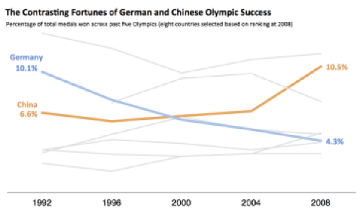
Here is a proposed solution for telling this story:
The first thing to point out is that we have used the calculated data for medals
won as a percentage of the total. This is more appropriate for this story as it
helps standardize and contextualize the performance across all events in a more
comparable way.


Search WWH ::

Custom Search