Graphics Reference
In-Depth Information
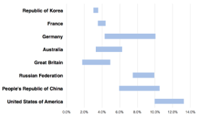
Through interpreting this chart in conjunction with the descriptive statistics we just
collected, we are able to form some interesting data questions about the subject and
start to get a feel about the main stories, such as:
Question
Answer
Which countries have experienced a
significant change in their medal-winning
performance levels?
We're looking for the widest bars to show
the variability, this could be improvement,
decline or inconsistency. We would identify
the spread of Germany and China as being
particularly interesting.
Which countries have maintained
consistency in their performance levels?
Now we're looking for the narrowest bars,
the tightest of value ranges. This leads to
noticing the USA, France, and especially
Republic of Korea.
What have been the most interesting
country stories in terms of the transition
of their performance and rankings?
Possibly too hard to see with this chart, but
there is potentially something going on with
the bars that intersect and exceed the lengths
of others. At this stage, the story of China
seems to stand out as being something to
look out for.
Let's now repeat the same chart type but apply it to a transformed version of the
data that has been standardized to show the medals won as a percentage of the
overall total:


Search WWH ::

Custom Search