Graphics Reference
In-Depth Information
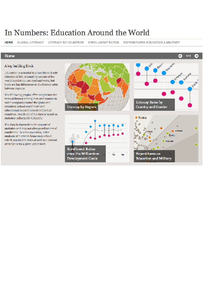
In the example shown in the following screenshot, we see a recent visualization
project that was developed to enlighten people about the matter of education
around the world, presenting some striking facts and figures:
Image from "In Numbers: Education Around the World" (
http://visualdata.dw.de/specials/
bildung/en/index.html
), created by Gregor Aisch for Deutsche Welle.
As you might imagine there will be myriad ways of telling data stories about
global education matters. In such contexts, a designer is faced with the challenge of
rationalizing so many different potential dimensions.
The strength of this particular project comes from the scoping and definition of the
chosen narrative and slices of analysis. Rather than bombarding the reader with
endless pages of facts and figures, or offering seemingly infinite combinations of
interactive variable selections, the subject is framed for us around a small number
of interesting angles about education: literacy by region, literacy rates by country/
gender, enrollment ratios, and expenditure on education versus military.
As we then navigate through each story panel we are presented with a series of
explanatory visualizations. They don't just show data, they present and explain it.
Search WWH ::

Custom Search