Graphics Reference
In-Depth Information
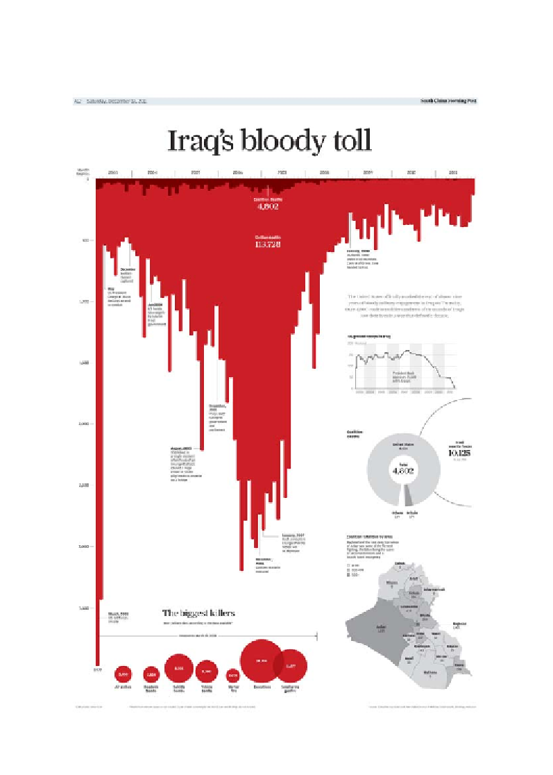
In the following image, we see a section taken from a newspaper infographic that
depicted Iraq's bloody toll. While the chart method is nothing more complex than
an upside down bar chart, the tone is very impactive and metaphorically emphatic,
creating a strong emotional impact to the story it portrays:
Image from "Iraq's Bloody Toll", published in the South China Morning Post on Saturday,
December 13, 2011 (
http://graphics-info.blogspot.hk/2012/09/malofiej-20-look-at-our-
participation.html
), created by Simon Scarr.
Search WWH ::

Custom Search