Graphics Reference
In-Depth Information
On the left-hand side of the diagram, we see a blue segment representing 82 percent
and an orange segment representing 18 percent. These are the actual values. However,
when we introduce a third dimension on the right—incidentally, a dimension which
is purely decorative and has no relationship with data values—our eyes are deceived
because we are not capable of easily adjusting our interpretation of the values across
this isometric projection. With the introduction of the extra dimension and the visible
height of the pie itself, we now perceive 91 percent of the visible area as blue and only
9 percent orange. This is clearly a hugely distorted reading of the values.
Another similar example comes from a Wikipedia fundraising campaign from a few
years ago and a progress bar depicting the status of their efforts; as shown in the
following screenshot:
Image published under the terms of "Creative Commons Attribution-Share Alike", source:
https://donate.wikimedia.org/
As with the pie chart, for a bar chart we perceive the visible pixels as being
representative of the values. The label indicates a total of
$0.8M USD
had been
raised (10.7 percent towards target) but if you calculate the actual length of the
bar displayed, this occupies 24.6 percent of the overall bar length. Once again, a
significant distortion of the truth.
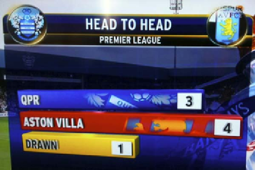
This next example is a demonstration of where aesthetics and style completely
hijack a visualization. Here, we have a still showing a 3D bar chart that swooshes
impressively onto the screens of those watching soccer on TV in the UK:


Search WWH ::

Custom Search