Graphics Reference
In-Depth Information
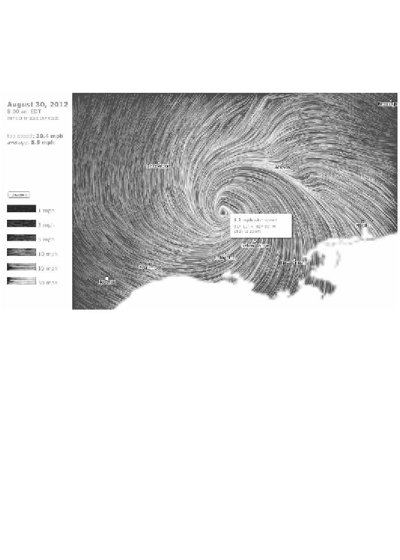
Throughout this topic, we will see examples of designs that have succeeded in creating
elegance in form and in function. The following image is taken from an animated wind
map developed by Fernanda Viégas and Martin Wattenberg. It is a beautiful piece of
work, exceptionally well designed and executed but it also serves its purpose as a way
of informing users about the wind patterns, strength, and directions occurring across
the United States. This is form and function in spiritual union:
Image from "Wind Map" (
http://hint.fm/wind/
) created by Fernanda Viégas and Martin Wattenberg
The general advice, especially for beginners, is to initially focus on securing the
functional aspects of your visualization. First, try to achieve the foundation of
something that informs—that functions—before exploring the ways of enhancing
its form. The simplest analogy would be build the house before decorating it, but
I wouldn't want to create too much separation between the two as they are often
intrinsically linked. Over time, you will be much more confident and capable of
synthesizing the two demands in harmony. We shall discuss this in more depth
in
Chapter 4
,
Conceiving and Reasoning Visualization Design Options
.
Justifying the selection of everything we do
The following is a quote from Amanda Cox (
http://vimeo.com/29391942
), who
works as a graphics editor at the New York Times:
"We're so busy thinking about if we can do things, we forget to consider whether
we should."
Search WWH ::

Custom Search