Graphics Reference
In-Depth Information
There are many excellent Tableau practitioners out there whose work you should
check out, such as Craig Bloodworth (
http://www.theinformationlab.co.uk/
blog/
), Jérôme Cukier (
http://www.jeromecukier.net/
), and Ben Jones
(
http://dataremixed.com/
), among many others.
While the overall landscape of BI is patchy in terms of its visualization quality, you will
find some good additional solutions such as QlikView (
http://www.qlikview.com/
uk
),
TIBCO Spotfire
(
http://spotfire.tibco.com/
),
Grapheur
(
http://grapheur.
com/
), and
Panopticon
(
http://www.panopticon.com/
).
You will also find that there are many chart production tools available online.
Google has created a number of different ways to create visualizations through
its
Chart Tools
(
https://developers.google.com/chart/
) and
Visualization
API
(
https://developers.google.com/chart/interactive/docs/reference
)
environments. While you can exploit these tools without the need for programming
skills, the API platforms do enable developers to enhance the functional and design
options themselves.
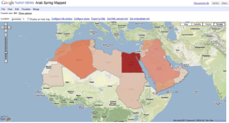
Additionally,
Google Fusion Tables
(
http://www.google.com/drive/start/
apps.html
) offers a convenient method for publishing simple choropleth maps,
timelines, and a variety of reasonably interactive charts.
Sample screenshot of Google Fusion Table's charting capabilities


Search WWH ::

Custom Search