Graphics Reference
In-Depth Information
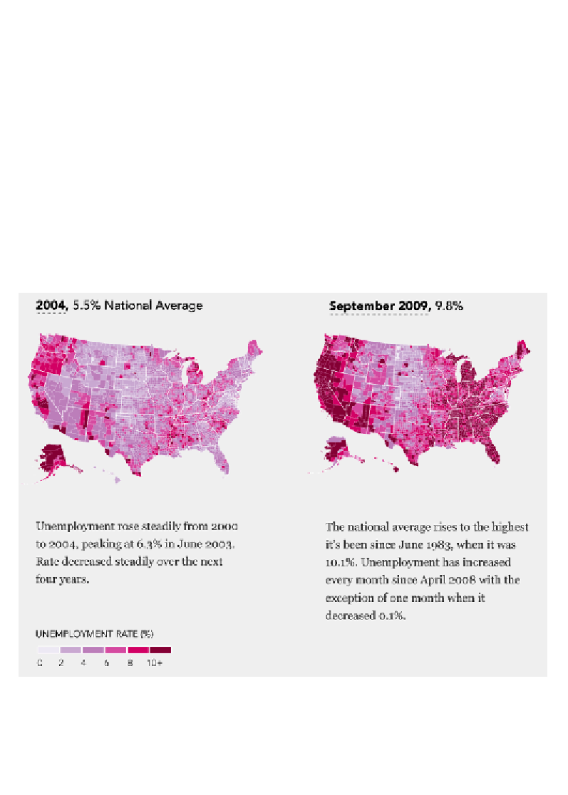
Choropleth map
Data variables
: 2 x quantitative-interval, 1 x quantitative-ratio.
Visual variables
: Position, color-saturation/lightness.
Description
: As described in the previous chapter, choropleth maps color the
constituent geographic units (such as states or counties) based on quantitative
values using a sequential or diverging scheme of saturation/lightness. While
these are popular techniques, there is a recognized shortcoming caused by the
fact that populations are not uniformly distributed. There is a potential distorting
effect created by the prominence of larger geographic areas which may not be
proportionately representative of the population of data. Make sure you choose
your color classifications carefully to ensure you accurately represent the
chronological prominence of increasing quantities. An example of a choropleth
map is shown in the following screenshot:
Image (cropped) from "Unemployment, 2004 to present" (
http://projects.flowingdata.com/
america/unemployment/raw.html
), created by Nathan Yau
Search WWH ::

Custom Search