Graphics Reference
In-Depth Information
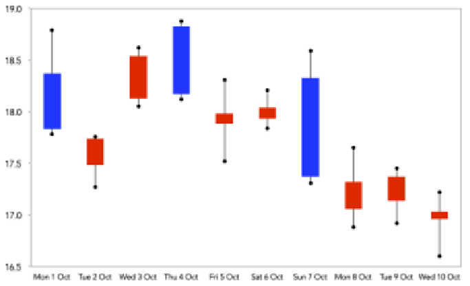
Candlestick chart (or box and whiskers plot,
OHLC chart)
Data variables
: 1 x quantitative-interval, 4 x quantitative-ratio.
Visual variables
: Position, height, color-hue.
Description
: The candlestick chart is commonly used in financial contexts to
reveal the key statistics about a stock market for a given timeframe (often daily).
In the following example, we see stock market changes by day based on the OHLC
measures—opening, highest, lowest, and closing prices. The height of the central
bar indicates the change from the opening to closing price and the color tells
us if this is an increase or decrease. This is a chart that clearly requires a certain
amount of experiential learning in order to read it efficiently. However, one you've
achieved this you will see how extremely dense and powerful these displays are.
They are similar in concept to the "box and whiskers plot", which focus on the
statistical distribution of a set of values (showing upper and lower quartiles as
well as the median).
Barcode chart
Data variables
: 1 x quantitative-interval, 3 x categorical.
Visual variables
: Position, symbol, color-hue.


Search WWH ::

Custom Search