Graphics Reference
In-Depth Information
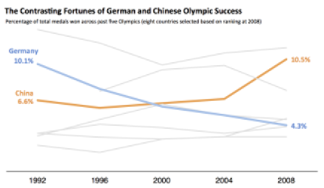
An example is shown in the following image:
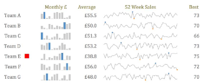
Sparklines
Data variables
: 1 x quantitative-interval, 1 x quantitative-ratio.
Visual variables
: Position, slope.
Description
: Sparklines aren't necessarily a variation on the line chart, rather,
a clever use of them. They were conceived by Edward Tufte and are described
as "intense, word-sized graphics". They take advantage of our visual perception
capabilities to discriminate changes even at such a low resolution in terms of size.
They facilitate opportunities to construct particularly dense visual displays of
data in small space and so are particularly applicable for use on dashboards.
An example is shown here:


Search WWH ::

Custom Search