Graphics Reference
In-Depth Information
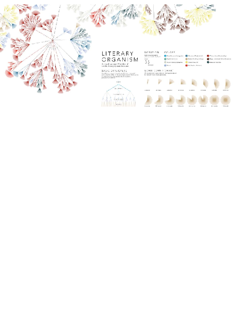
Image from "Literary Organism" (
http://itsbeenreal.co.uk/index.php?/wwwords/
literary-organism/
), created by Stefanie Posavec
Showing changes over time
The following examples show alternative ways of graphically showing changes
over time:
Line chart
Data variables
: 1 x quantitative-interval, 1 x quantitative-ratio, 1 x categorical.
Visual variables
: Position, slope, color-hue.
Description
: Line charts are something we should all be familiar with. They are used
to compare a continuous quantitative variable on the x axis and the size of values on
the y axis. The vertical points are joined up using lines to show the shifting trajectory
through the resulting slopes. Line charts can help unlock powerful stories of the
relative or (maybe) related transition of categorical values. Unlike bar charts, the y
axis doesn't need to start from zero because we are looking at the relative pattern of
the data journey.
Search WWH ::

Custom Search