Graphics Reference
In-Depth Information
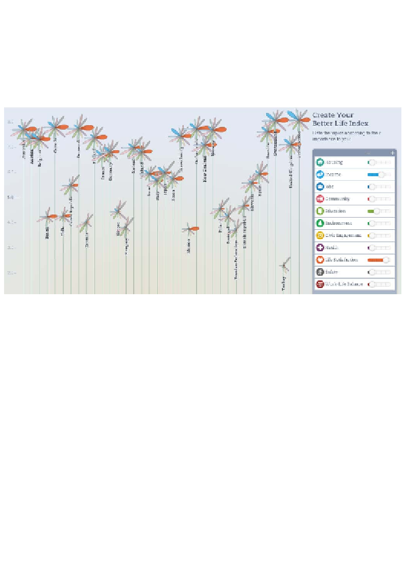
Description
: A glyph chart is based on a shape (in the following example, a flower)
being the main artifact of representation. The physical properties of the shape
(through a feature such as a petal) represent different categorical variables; they
are sized according to the associated quantitative value and distinguished through
color. While absolute magnitude judgments are not easily achieved nor intended,
the hierarchy of the data (big, medium, and small values) is possible to interpret
and the typical deployment of interactivity enables further exploration.
Image from "OECD Better Life Index" (
http://oecdbetterlifeindex.org
),
created by Moritz Stefaner (
htpp://moritz.stefaner.eu
) in collaboration with
Raureif GmbH (
http://raureif.net
)
Sankey diagram
Data variables
: Multiple x categorical, multiple x quantitative.
Visual variables
: Height, position, link, width, color-hue.
Description
: Sankey diagrams are used to convey the idea of flow. They portray
constituent quantities of a series of associated categorical values, across a number
of "stages", with the ongoing associations represented by connecting bands. The
width of these links indicates the proportional flow from one stage to another. They
are useful for showing situations where elements transform and divide over key
events, as shown here displaying the breakdown of different fuels, how they are
transformed and then ultimately used.
Search WWH ::

Custom Search