Graphics Reference
In-Depth Information
• A brief description of each type's functional purpose and application.
• An example to illustrate what each chart looks like. Many of these have been
seen elsewhere in this topic so it will hopefully cement your understanding.
Remember, you may often need a combination of different visualization methods
and multiple chart types blended together to forge a multidimensional story.
Comparing categories
The following examples present chart types that facilitate the comparison of
categorical values.
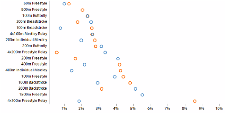
Dot plot
Data variables
: 2 x categorical, 1 x quantitative.
Visual variables
: Position, color-hue, symbol.
Description
: A dot plot compares categorical variables by representing quantitative
values with a single mark, such as a dot or symbol. The use of sorting helps you
to clearly see the range and distribution of values. You can also combine multiple
categorical value series on to the same chart distinguishing them using color or
variation in symbol. Beyond two series things do start to get somewhat cluttered
and hard to read.


Search WWH ::

Custom Search