Graphics Reference
In-Depth Information
Conversely, if the complexity and variety of the data structures that you are working
with make it incompatible with a static portrayal, that's exactly the situation that
warrants interactive features.
If you have decided that facilitating interactivity is required for your visualization,
you have many different features and functions to contemplate deploying.
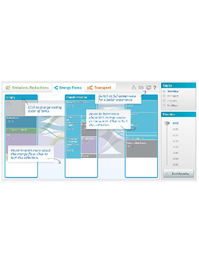
The following interactive Sankey diagram is a perfect demonstration of a project
that effectively integrates a host of useful interactive features that maximize
the exploratory potential of the subject matter. It was developed to present a
breakdown of the flow of different sources and types of fuels, from supply
through transformation, and to end usage:
Image from "Energy Technology Perspectives 2012 Online Data" at
http://www.iea.org/etp/explore
©
OECD/IEA 2012, developed by Raureif GmbH and Christian Behrens
Notice, through the annotated tips, the range of different actions you can trigger in
order to see the data from many different perspectives. That is a key factor behind
the deployment of interactivity—being able to take on multiple views of a subject
matter to really understand the stories emerging.
Search WWH ::

Custom Search