Graphics Reference
In-Depth Information
The use of predetermined color schemes in visualization is to be expected, especially
because it helps maintain consistency and recognition of brand. For a designer, it can
be a hindrance and so it reemphasizes the importance of identifying this requirement
in your early part of the methodology.
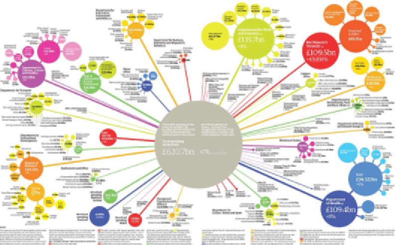
Here is an example from the Guardian newspaper. This bubble hierarchy diagram
shows the breakdown of UK Government spending by department. The image
contains a wide range of colors but they hold no quantitative or categorical meaning.
Aside from helping to distinguish the different clusters, they perform a largely
decorative function that makes the piece more attractive to engage with and help
reinforce the organization's visual identity, which is typically a very colorful spectrum:
Image from "UK public spending by government department, 2008/09" (
http://www.guardian.co.uk/
news/datablog/2010/may/17/uk-public-spending-departments-money-cuts
), by Michael
Robinson and Jenny Ridley for the Guardian
Many organizations such as the Guardian and also the New York Times have
developed such a strong visual identity from their respective works, consistently
observing defined color palettes, that you can now immediately identify their work
from the style this color usage perpetrates.


Search WWH ::

Custom Search