Graphics Reference
In-Depth Information
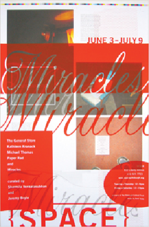
POSITIVE AND NEGATIVE
space, as they relate to type and ink, are used in an interesting repe-
tition to create more ambiguous space in this poster. The red bar becomes flat against the pho-
tographs, but the reversed-out type seems to come forward, as does its positive repetition below.
Although the photographs seem flat toward the top, they seem to drop into a deeper space down
below, as they contrast the flat, linear quality of the script type.
Brett Yasko
United States
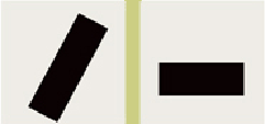
Comparison of an active figure/ ground relationship (left) with an inactive figure/ground relation-
ship (right) hints at the potential for meaning to be perceived even in such a fundamentally simple,
abstract environment. Compare these pairs of simple, opposing ideas between the two examples:
loud/quiet; aggressive/passive; nervous/sedate; complex/simple; energetic/weak; and living/dead.