Graphics Reference
In-Depth Information
particularly friendly. As you might guess, the relative accessibility of type greatly de-
pends on the message being conveyed. Making portions of type illegible, over-bear-
ing, aggressive, sharp and dangerous, nerve-wracking, or fragile is perfectly accept-
able—indeed, preferable—when the job calls for it. There is no excuse for typography
that doesn't viscerally communicate in an appropriate way, even if this means frighten-
ing, frustrating, or confusing viewers in service of the right concept.
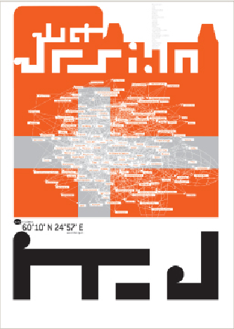
It's bold, it's strong, it's intriguing, and it's not immediately legible. . . but the typography in this
poster is clearly interested in expressing a design firm's personal vision, idiosyncratic language,
and search for originality. Typography of this kind plays well with specific audiences that enjoy
being challenged by aggressive visual messaging and participating in the attitude it conjures.
Dochdesign
Germany