Graphics Reference
In-Depth Information
9 Treat the type as image, as though it's just as important.
There are always times when typography needs to shut up and get out of the way of
the pictures—especially when the type accompanies catalogued artwork or is acting in
support of images that are carrying the brunt of the communication burden. In such in-
stances, treating the type as quietly and as neutrally as possible can be most appropriate.
Even so, the relationship of the typography to the format will bear some consideration,
as will consideration of its size, spacing, and stylistic presentation.
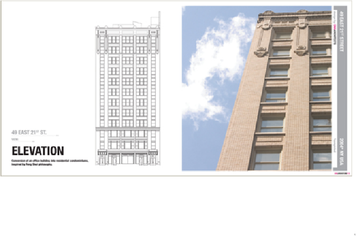
The focus of this brochure is the client's architecture, both in elevation and image. The designer
respectfully shuts up and lets the architect's work do the talking. At the same time, however, the
designer provides a clear and consistent hierarchy of sizes, weights, and locations for informa-
tional components.
Not From Here
United States