Graphics Reference
In-Depth Information
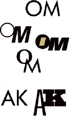
A study of letterform combinations reveals both congruence and opposition. The inherent differ-
ences between the O and M are made more pronounced by changing the posture, weights, styles,
and positions of the letters, yet the combinations in which they share one—or two—aspects seem
richer. The inherent similarities of the A and K allow for more dramatic opposition because their
structural similarity is so powerfully congruent.
Positioning Strategies
Consider the location of the type relative to the image and the
attributes of the image's outer shape in relation to the format. An image cropped into a
rectangle presents three options: the type might be enclosed within the image; the type
might be outside, or adjacent to the image; or the type might cross the image and con-
nect the space around it to its interior. Type that is placed within the field of a rectan-
gular image becomes part of it. Type adjacent to a rectangular image remains a separate
entity. Its relationship to the image depends on its positioning and any correspondence
between its compositional elements and those in the image. The type might align with
the top edge of the image rectangle, or it might rest elsewhere, perhaps in line with a
division between light and dark inside the rectangle. Type that crosses over an image
and into the format space becomes both part of the image in the rectangle and part of
the elements on the page. Its location in space becomes ambiguous.