Graphics Reference
In-Depth Information
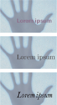
In these three examples, the visual relationship between type and image is one of opposition, but
the choice of type style and treatment in each example shares some formal relationship with the
image.
1: A soft-focus photograph with muted detail and light tonal values overall is contrasted by a bold-
weight sans serif typeface, but the subdued color of the type shares a tonal and color relationship
with the image.
2: A regular-weight modern serif face with a great deal of contrast in the strokes—the opposite of
the photo-graph's lack of contrast. The geometric quality of the typeface responds to shapes ap-
parent in the image.
3: A lightweight text with very active details; the type's stylized quality counteracts the passive,
neutral character of the image, but its arrangement within the image responds to areas of light and
dark.