Graphics Reference
In-Depth Information
elements—image, format, and type—appear to share the same physical space.
Formal
Opposition
Relating typographic elements to images by contrasting their visual charac-
teristics is also a viable way of integrating them. Although seemingly counterintuitive,
creating formal opposition between the two kinds of material actually can help clari-
fy their individual characteristics. Contrast is one of the most powerful qualities that a
designer can use to integrate material—by their very difference, two opposing visual
elements become more clearly identified and understood. Within a letterform combina-
tion of an M and an O, for example, the fact of the M's angularity is reinforced by the
curved strokes of the O. The movement within each form is made more pronounced,
and the two elements essentially fight for dominance. The caveat is that some congruen-
ce between the elements must also exist so that the opposing characteristics are brought
clearly into focus. In the same way that a hierarchy is destroyed if all the elements are
completely different, the strength of the contrast in opposing forms is weakened if all
their characteristics are completely different.
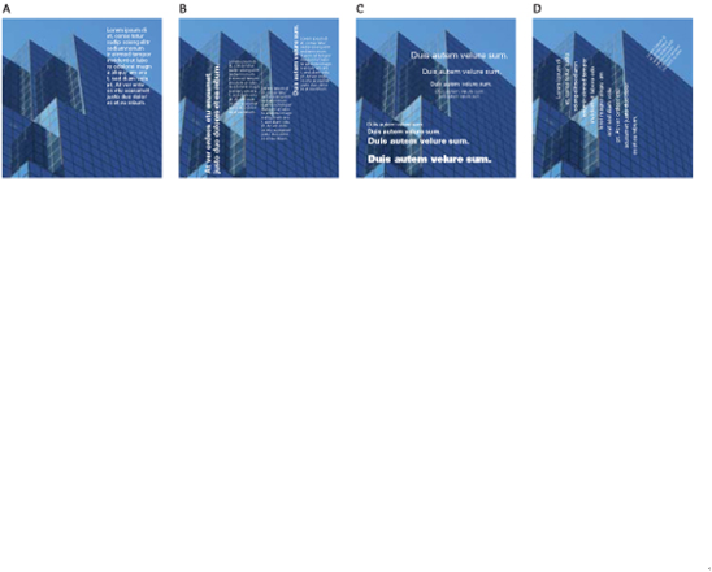
The type in this series of studies is related to the image alternately through: position (A); repetition
of linear movement and alternation of weights (B); mimicry of depth and perspective (C); and the
angle of its alignment (D).
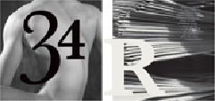
The numerals and the figure have similar shapes and movement. Note how the position of the nu-
meral 3 highlights the mass of the shoulder and the curve of the torso. The light and dark areas of
the image show similarity to the locations, shapes, sizes, and tonality of the type forms.
Visual Logic
Structuring the Page