Graphics Reference
In-Depth Information
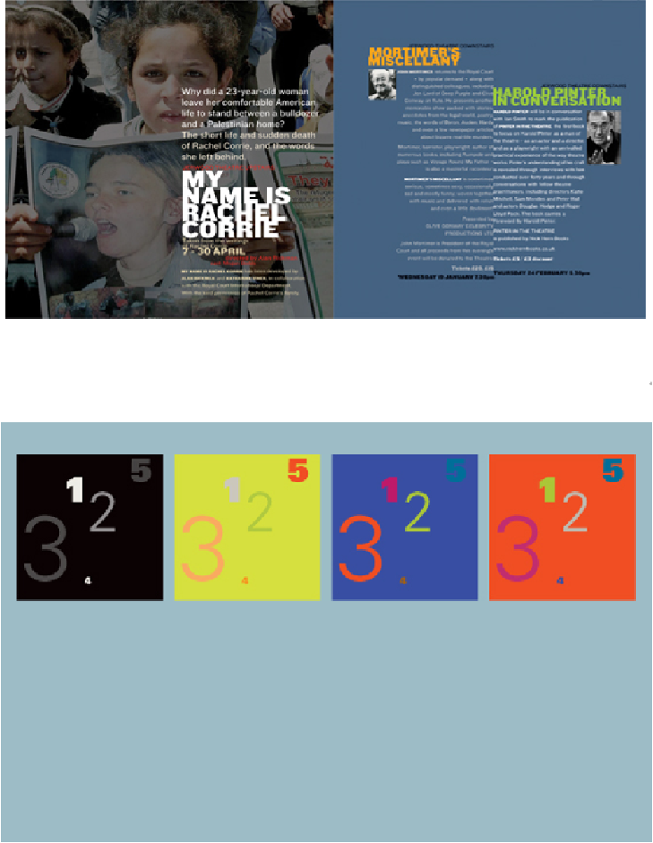
INCREASED VALUE CONTRAST
and intensity bring more important elements into the foreground
and establish their positions toward the top of the hierarchy.
Research Studios
United Kingdom
This composition of numbers demonstrates the effect of chromatic color on hierarchy as simply as
possible, showing the layout in the same set of colors, but with the colors distributed differently
among the numbers each time. The base composition presents the numbers in their natural order,
using size, weight, position, and value to define their sequence as a starting point for considera-
tion. The variations that follow swap colors to reorder them despite their initial presentation. While
most design projects will likely be more complex, it is easy to see how relationships of hue, value,
temperature, and saturation can quickly change not only the apparent spatial depth and presence of
elements, but also the sequence in which they are perceived. This knowledge has dramatic implic-
ations for how information can be ordered by using chromatic relationships to enhance already-
defined hierarchic structure—at the same time potentially delivering color-based messages and
creating visual linsk between type and image material.