Graphics Reference
In-Depth Information
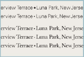
the surrounding characters. With an uppercase A, a following superscript character might benefit
from being tucked a little closer to compensate for the A's inward diagonal thrust and therefore,
intrusive counterspace.
UH
-
OH
. . .
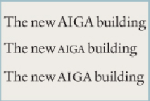
SMALL CAPS!
Small caps used for acronyms, although smaller than uppercase letters,
still need additional space around them to improve their recognition. The small caps of many fonts
are too small and appear lighter in weight than surrounding text. Adjust their point size up by as
much as a point or two to achieve uniform weight and spacing, but not so much as to confuse them
with the uppercase.
STYLE YOUR BULLETS
.
The default bullet is usually enormous and distracting compared to the
typeface in which it appears. The bullet needs to be noticeable but not stick out; slightly heavier
than the text's vertical stroke weight is enough. Feel free to change the bullet's typeface—or use a
dingbat or even a period, shifted off the baseline—to bring it stylistically closer to the surrounding
text.
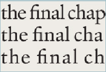
A CLUE TO OPTIMAL
:
THE LIGATURES
.
Ligatures—specially drawn characters that optically cor-
rect for spacing difficulties in particular combinations of letters—provide a clue to the optimal