Graphics Reference
In-Depth Information
paragraph, the type size, and its spacing. The space between lines should be noticeably
larger than the optical height of the lines, but not so much that it becomes pronounced.
Similarly, the leading must not be so tight that the reader locates the beginning of the
same line after the return and begins reading it again. As paragraph width increases,
so must the leading, so that the beginnings of the lines are more easily distinguished.
Oddly, as the width of a paragraph narrows, the leading must also be increased: other-
wise, the reader might grab several lines together because the snapshots he or she takes
while scanning encompass the full paragraph width.
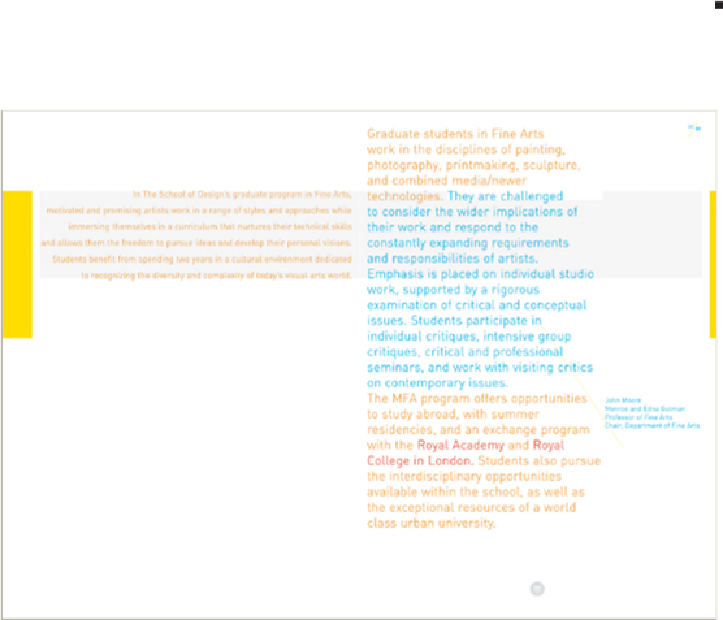
IN THIS PAGE SPREAD
from a brochure, the designer uses larger type in the vertical column but
smaller type in the wide paragraph at the left; in both cases the leading remains constant. This
causes the vertical column to read more quickly (having optimal qualities of character count and
spacing), which increases its vertical pull in the format. The smaller type at the left reads more
slowly because the line length of the paragraph is far wider than optimal, and the leading appears
greater between the lines; the slower, horizontal emphasis of this text is a visual contrast to the
vertical column.
Paone Design Associates
United States