Graphics Reference
In-Depth Information
in overall weight to the strokes of Univers 45 set at 13 points in size on the same page.
Both are sans serif; their different sizes create contrast in their counters and linearity
even as the overall weight of the smaller Futura begins to approach the stroke weight of
the larger Univers 45. The historical quality of typefaces may also play a role in how
they are combined. Since the average reader usually associates certain qualities with a
given typeface because of its classical or modern drawing qualities, mixing typefaces
from related—or dramatically different—periods might help generate additional mes-
sages. A Roman capital, such as Trajan, in combination with a geometric sans serif,
such as Futura, not only might present a great deal of contrasting typographic color but
also might allude to a historical association: old and new, continuum, evolution, innov-
ation, and so on. In this particular case, both Trajan and Futura are based on Roman
geometric proportion, despite being separated by 2,000 years of history.
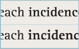
The bold weight of this text face isn't much different from the regular weight; a bold face from
an alternate, yet similar, family can be substituted. Note the similarity of the spurs, terminals, and
other details between the two faces.
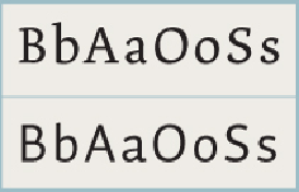
In choosing to mix typefaces, select counterparts with enough contrast, but be aware of their simil-
arities as well. In this example, the serif and the sans serif are radically different in stroke contrast
and detail, but their construction is similar—take note of the slight angularity of the curves; the
oblique emphasis in the
O
s; the joint angle in the lowercase
a;
the abrupt joint in the lowercase
b.