Graphics Reference
In-Depth Information
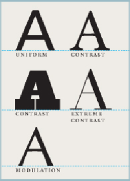
Contrast
The strokes within the letters of a typeface may be uniform in weight or may vary sig-
nificantly; the more they do so, the more contrast the face is said to exhibit. Contrast within a
stroke—such as flaring from thin to thick—is called modulation; the rate at which this occurs is
referred to as the typeface's ductus.
Visual Variations
The letterforms in all typefaces vary from their archetypes in only
six aspects: case, weight, contrast, width, posture, and style. Type designers, referring to
historical models, subtly alter and combine the variables in these six aspects to create in-
dividual type styles that, although appearing remarkably different, all convey the same
information about the letterforms in the alphabet. Different approaches to the drawing
of typefaces have evolved, become popular, or been discarded over time; as a result, the
formal aspects of particular typefaces often carry associations with specific periods in
history, cultural movements, and geographic location—some typefaces feel “modern”
or “classical,” while others feel “French” or “English.” More important, the drawing of
a typeface will often exhibit a particular kind of rhythm, or cadence, as well as provide
a distinct physical presence in a design that may connote feelings—fast or slow, ag-
gressive or elegant, cheap or reliable. Consider that not all viewers will perceive the
same associations in a given typeface; the designer must carefully evaluate his or her
typeface selection in the context of the audience for a particular piece. Additionally,
mixing typefaces that are incongruous with the subject matter—for example, using an