Graphics Reference
In-Depth Information
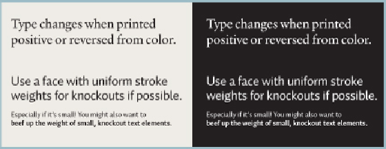
The strength of a typeface's stroke weights, at any size, will present optical size disparities
between type printed positive, on a light background, and in reverse, on a dark background. Gener-
ally, a typeface will appear smaller and denser if reversed from a solid field. Typefaces with small
x-heights, extreme contrast, or extremely thin strokes overall usually need to be enlarged slightly
to ensure their strokes are robust enough to hold up against ink gain that might threaten their legib-
ility.
Printing exacerbates the issue of space between letters, especially at smaller sizes. Ink bleeds when
it hits paper; as a result, the space between and within letters is made smaller. Trying to judge
proper spacing on a monitor, with its coarse resolution, is nearly impossible; a laser printer or an
inkjet printer creates some bloating in the type but not nearly as much as will happen on press. A
designer's prior printing experience will help him or her judge these spacing issues.


