Graphics Reference
In-Depth Information
THE YELLOW VERTICAL STROKES
in this logotype create a more consistent rhythm of stroke
and counter alternation behind the hairline blue strokes, which change in shape and rhythm.
Thomas Csano
Canada
The same word is set here in three faces at 36 points. The oldstyle serif appears smallest; its lower-
case letters have a proportionally small x-height. Because the sans-serif lower-case letters are lar-
ger in proportion to the cap height, they appear larger; the same is true of the modern serif to the
right.
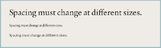
The same words, set first at 14 points in size and again at 6 points. Uncorrected, the spacing in the
smaller type is inadequate for good character recognition. Adding space between letters greatly
improves their legibility and their look.