Graphics Reference
In-Depth Information
Structure and Optics
Issues Related to Style
Mechanics of Text
Texture and Space
Type as Information
How Color Changes Type
At the other extreme, letters that are set too loosely become singular elements, divorced
from the line and recognizable as individual forms, making the appraisal of words dif-
ficult. Evenly set sequences of letters show a consistent, rhythmic alternation of black
and white—form and counterform repeating at the same rate from left to right. The
primary difficulty in achieving evenly spaced type is that the letters are of different
densities. Some letters are lighter or darker than others.
Added to this phenomenon are the directional thrusts of different strokes and the varied
sizes and shapes of the counterforms. Some are very open, some are closed, and some
are decidedly uneven in relation to the distribution of strokes in a given letter. To correct
for these disparities, digital typefaces are programmed to add and subtract space from
between different pairs of letters, depending on what the combinations are. These sets
of letters, called “kerning pairs,” provide for most circumstances of letterform combin-
ation, but not all. Invariably, a designer will need to correct unusual spacing that the
computer's software is unable to address.
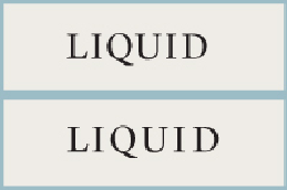
Always evaluate the spacing needs of a type component on a case-by-case basis. Some letters in a
particular word are going to cause unresolvable problems, either because of their dramatic asym-
metry, deep counters, or overall density. When presented with a word (or phrase of reasonable
length), take time to correct the spacing throughout based on this worst-case scenario. In this word,
nothing really can be done about the enormous counter following the
L.
To make sure it doesn't