Graphics Reference
In-Depth Information
intersection of hue and saturation, the boundary between two colors of the same value
will be nearly impossible to see.
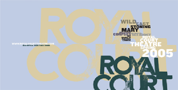
THE COLOR VALUES
in this brochure spread affects the reading order, or hierarchy, of the text.
The darkest elements read first because they have the most value contrast with the color of the
background; middle-value and lighter elements read later because they have less value contrast
against the background.
Research Studios
United Kingdom
The effect of value relationships is shown here in a close-in comparison of two colors of relatively
similar hue and intensity; the greater the difference in the value of either color—or of the color
field on which it sits—the greater the effect on relative intensity. In the lower example, the deeper
ochre becomes more intense as the yellow orange lightens.