Information Technology Reference
In-Depth Information
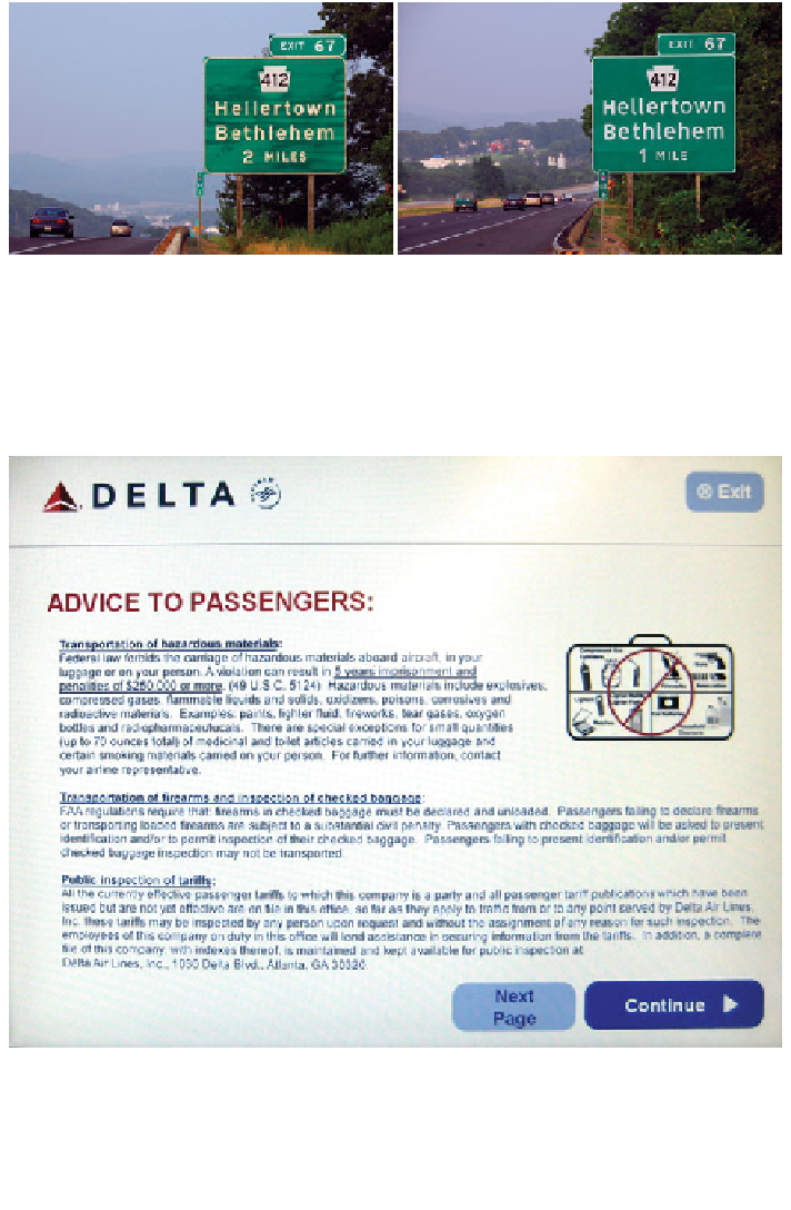
Fig. 7.3 The previous standard font, Highway Gothic (left) and in the ClearviewHwy font
(right). These signs are on I-78, near Allentown, PA. The Clearview has larger holes in letters like
e and o, and slightly more readable serifs on letters like l and t. The text is particularly more
readable at night when illuminated by headlights. (Photos Don Meeker and used with
permission)
Fig. 7.4 A screen shot from Feb. 2008 that would be difficult to read because of font size and
line width. Indeed, if passengers did read this screen, it would greatly slow the check-in process,
which runs counter to the purpose of the kiosk, which is to make check-in faster (as opposed to
safer or more pleasurable). This page also shows a change in the service as a system moves
online. The original system, human check-in, did not pass as much information to users—but
perhaps it did not need to
Search WWH ::

Custom Search