Graphics Reference
In-Depth Information
Why should the title be at the top? Did you notice that the title uses a sans serif
font? Why is that? Something else the sotware has done is to position the tick marks
at sensible locations within the range of the data. Also, the axes have their tick marks
and tick labels pointing away from the region where the data are plotted (other sot-
ware may do this differently). Does that matter?
In some of these cases, there are clear reasons for doing things a certain way (e.g.
toimproveclarityorvisualimpact;Cleveland,
,
;Robbins,
;Tute,
).
In other cases, the choice is more subjective or a matter of tradition. he main point
is that there are a number of ways that the sotware could do these things. What is
important is that the sotware should provide a good default choice.
Trellis Plots
Agood example of agraphics system that provides sensible defaults is the Trellis sys-
tem (Becker et al.,
). he choice of default values in this system has been guided
by the results of studies in human perception (Cleveland and McGill,
) so that
the information within a plot will be conveyed quickly and correctly to the viewer.
In R,thelattice package (Sarkar,
) implements Trellis plots. Figure
.
shows
a Trellis version of a basic scatterplot. One subtle, but well-founded, difference with
Fig.
.
is the fact that the labels on the tick marks of the y-axis are horizontal so
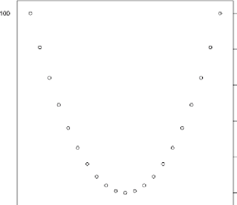
Figure
.
.
A basic Trellis scatterplot, which has a different default appearance from the scatterplot in
Fig.
.