Graphics Reference
In-Depth Information
Graphical excellence is nearly always multivariate.
-EdwardTute
Introduction
2.1
his chapter discusses drawing good graphics to visualize the information in data.
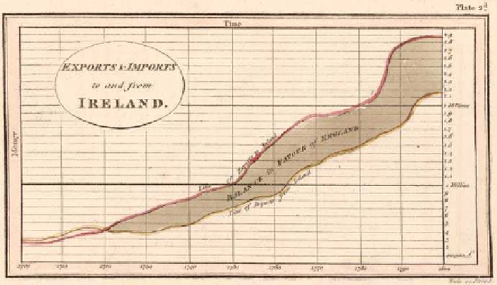
Graphics havebeenusedforalongtimetopresentdata. Figure
.
isascanned image
fromPlayfair's Commercial and Political Atlas of
, reproduced in Playfair (
).
he fairly continuous increase of both imports and exports, and the fact that the bal-
ance was in favour of England from
on, can be seen easily. Some improvements
might be made, but overall the display is effective and well drawn.
Data graphics are used extensively in scientific publications, in newspapersand in
the media generally. Many of those graphics do not fully convey the information in
the data they are supposed to be presenting and may even obscure it. What makes
a graphic display of data bad? More importantly, what makes one good? In any suc-
cessful graphic there must be an effective blending of content, context, construction
and design.
Content, Context and Construction
2.1.1
Whatisplottedcomesfirst,andwithoutcontentnoamountofcleverdesigncanbring
meaning toadisplay.Agoodgraphicwillconvey information, butagraphic isalways
part of a larger whole, the context, which provides its relevance. So a good graphic
will complement other related material and fit in, both in terms of content and also
Figure
.
.
Playfair's chart of trade between England and Ireland from
to