Graphics Reference
In-Depth Information
Figure
.
.
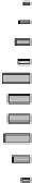
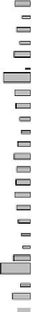
(Weighted) mosaicplots of the Mammals data. Raw data is shown on the let, while the
values on the right are standardized
case, we'd probably decide to split the clusters a bit further, take the HIPPO out of
cluster
,split cluster
into CAMEL-LLAMA and BUFFALO-SHEEP,take the ELE-
PHANT out of cluster
, and remove the RABBIT from cluster
. he most ques-
tionable cluster is the remaining one, cluster
,whichcontains the largest differences
according to the graphic. he new clusters found graphically basically correspond to
a vertical cut in the dendrogram with
clusters (see Fig.
.
).
Of course, it is a lot easier to compare different rows if they are spatially close to
each other. In the clustering algorithm, on the other hand, the order of observations
in the same cluster is not relevant. Shiting whole clusters makes it possible to com-
pare the distances between them.
he ability to reorder rows and columns quickly is crucial if we want to rapidly
draw conclusions from graphical displays. Similarities between objects become far
more obvious if these objects are close together. herefore, ways of reordering and
sorting rows and columns must be provided by the graphical user interface.
Bertin (
, p.
), proposes that the categories of a matrix be ordered “suitably”
to visualise clusters in the data. Falguerolles et al. (
) formalised Bertin's idea by
introducing a purity function to measure the “simplicity” of a Bertin plot. Optimal
orderings correspond to a minimum in the purity function. Depending on the data
and the exact definition of the purity function, there are, of course, various ways in
which the categories could be reordered. For row and column scores and a purity
function which counts the number of pairs in “correct” order, reordering according
to the purity function means sorting based on the scores.