Graphics Reference
In-Depth Information
Figure
.
.
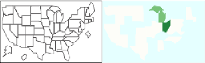
CCmaps, based on data from the USDA-NASS Web page. he same three variables
production,acreage,andyieldandthesamedataareshownasinFig.
.
;however,productionis
conditioned on acreage and yield here
the low class in terms of bushels. Since yield is calculated as production divided by
acreage, there are no big surprises here.
Carretal.(
)presentedCCmapsinthecontext ofhypothesis generation. Even
inthissimpleexamplewithjustthreeclassespervariable(low,middle,andhigh),one
maywonderwhythehigh-yieldstatesinthetoprowarenotallintherightmostpanel
with the four high acreage states as shown. Are less-soybean-acreage states smaller
states in terms of total area or do they have less available fertile acreage? Is water an
issue?Arethereothercropsthataremoreprofitable?hecomparativelayoutencour-
ages thought and the mapping context oten provides memory cues to what people
know about the regions shown.
he cautious reader may wonder how much the specific slider settings influence
thevisual impression, andthecurious readermayalso wonderabout all thenumbers
that appear in Fig.
.
. Since CCmaps is dynamic sotware, it is trivial to adjust the
two internal boundaries foreach slider tosee whathappens. hemaps change in real
timeandsodothenumbers.hepercentsbytheslidersindicatethepercentofregion
weights in each class. In this example, all states involved in soybean production are
weighted equally. For production,
% of the states (
out of
) with the highest
production are highlighted in dark green across all
maps. he next
% of the
states (
out of
) with production in the middle range are highlighted in medium
green across all maps. Finally, the remaining
% of the states (
out of
) with the