Graphics Reference
In-Depth Information
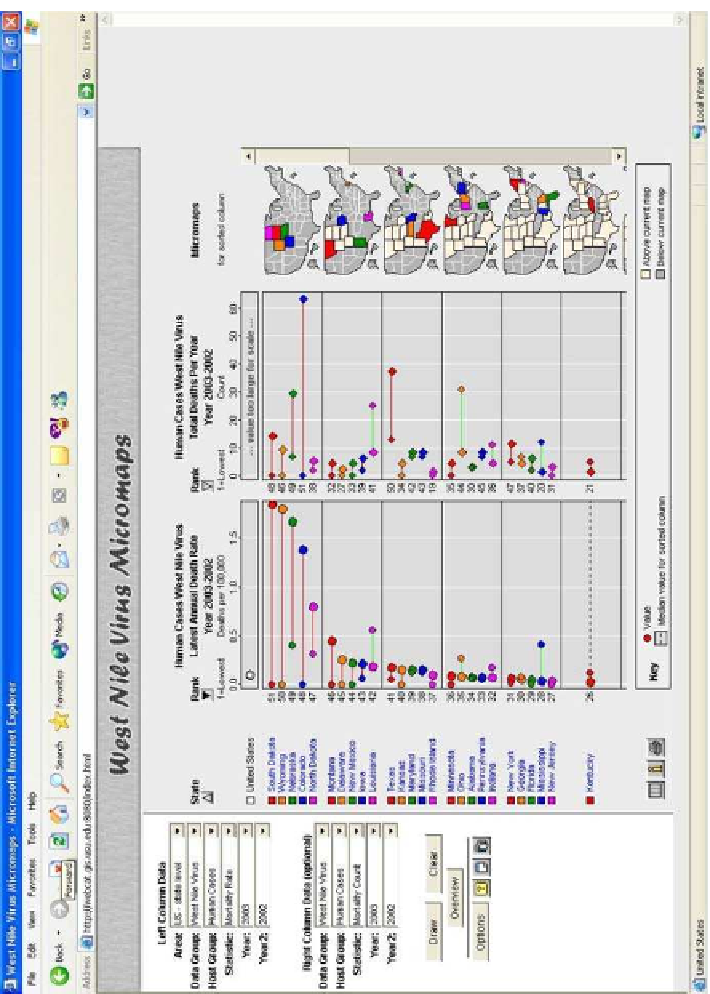
Figure
.
.
LM plots from the USU WNV Web page, showing WNV death rates and death counts for
the years
(small dots)and
(big dots). Red lines indicate an increase and green lines adecrease
from
to
. his interactive version of micromaps is accessible at
http://webcat.gis.usu.edu:
/index.html