Graphics Reference
In-Depth Information
Figure
.
.
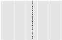
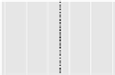
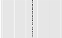
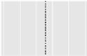
[his figure also appears in the color insert.] LM plots of the
Census of Agriculture,
showing soybean yield (in bushels per acre), acreage (in millions of acres), and production (in millions
of bushels) by state. he data are sorted by yield and show the
US states where soybeans were
planted. he “US Average” represents the median, i.e., the value that splits the data in half such that half
of the states have values below the median and the other half of the states have values above the
median. For example, Tennessee is the state with the median yield. his figure has been republished
from http://www.nass.usda.gov/research/gmsoyyap.htm without any modifications (and ideally should
contain much less white space in the lower part)