Graphics Reference
In-Depth Information
Figure
.
.
Different ways to visualize a classification tree model
of the training data falling into that node.heannotation describes the split variable.
Finally, in the third (bottom) plot, each node is represented by a rectangle of the
same size, but the colors within show the proportions of classes falling into a given
node.
Advancedtechniquesknownfromarea-basedplotscanbeusedinhierarchical
views as well if we consider nodes as area-based representations of the underlying
data. Figure
.
illustrates theuseof censored zooming inconjunction with treenode
size.
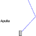
he top plot shows node representation without zoom, that is, the size of the root
nodecorrespondstoalldata. Allsubsequent splitspartition thesedata, andhencethe
node area, until terminal nodes are reached. If plotted truly proportionally, the last
two leaves split by the stearic variable would be hardly visible. herefore a minimal
size of a node is enforced, and the fact that this representation is not truly propor-
tional is denoted by a red border.
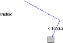
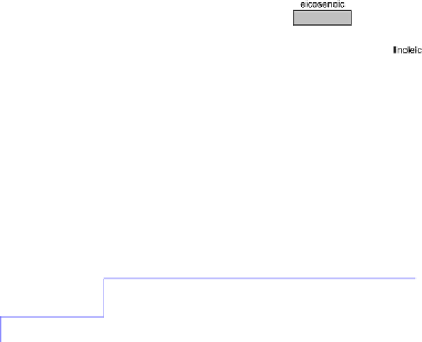
To provide a truly proportional comparison of small nodes, we can enlarge all
nodes by a given factor. In the bottom plot a factor of four was used. Now those
small nodes can be distinguished along with the class proportions, but large nodes
would need to be four times as big as in the first plot, obscuring large portions of the