Graphics Reference
In-Depth Information
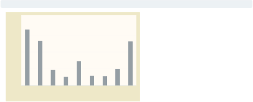
graph bar propval100, over(nsw) over(division)
nofill
The previous graph is not quite what
we want because we see every
division
shown with every
nsw
, but for example,
the Pacific region only appears in the
West. In
Bar : Over
(111), we see that
we can add the
nofill
option to show
only the combinations of
nsw
and
division
that exist in the data file.
Next, we will look at the colors of the
bars.
Uses allstates.dta & scheme vg past
North
North
North
North
South
South
South
West
West
N. Eng.Mid Atl
E
.N.C.W.N.C.
S
. Atl.
E
.S.C.W.S.CM
o
untaiP
a
cific
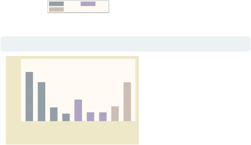
graph bar propval100, over(nsw) over(division) nofill
asyvars
The last graph is getting closer, but we
want the bars for North, South, and
West to be displayed in different colors
and labeled with a legend. In
Bar : Y-variables
(107), we see that the
asyvars
option will accomplish this.
Next, we will change the title for the
y
-axis.
Uses allstates.dta & scheme vg past
N. Eng. Mid Atl E.N.C. W.N.C. S. Atl.
E.S.C. W.S.C.Mountain
P
acific
North
South
West
graph bar propval100, over(nsw) over(division) nofill asyvars
ytitle("% homes over $100K")
Now, we want to put a title on the
y
-axis. In
Bar : Y-axis
(143), we see
examples illustrating the use of
ytitle()
for putting a title on the
y
-axis. Here, we put a title on the
y
-axis, but now we want to change the
labels for the
-axis to go from 0 to 80,
incrementing by 10.
Uses allstates.dta & scheme vg past
y
N. Eng. Mid Atl E.N.C. W.N.C. S. Atl.
E.S.C. W.S.C.Mountain
P
acific
North
South
West
The electronic form of this topic is solely for direct use at UCLA and only by faculty, students, and staff of UCLA.