Graphics Reference
In-Depth Information
twoway (scatter propval100 urban) (scatter rent700 urban)
(lfit propval100 urban) (lfit rent700 urban),
scheme(s1color)
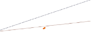
This is an example of a graph using the
s1color
scheme. Note how the lines
and markers are only differentiated by
their color. Both the plot area and the
border around the plot are white. Also,
note the absence of grid lines. (Stata
also has an
s1rcolor
scheme, in which
the plot area and border area are black.
This is not shown since it would be
dicult to read in print.)
Uses allstates.dta & scheme s1color
20
40
60
80
100
Percent urban 1990
% homes cost $100K+
% rents $700+/mo
Fitted values
Fitted values
twoway (scatter propval100 urban) (scatter rent700 urban)
(lfit propval100 urban) (lfit rent700 urban),
scheme(s1mono)
The
s1mono
scheme is similar to the
s1color
scheme in that the plot area
and border are white and the grid is
omitted. In a mono scheme, the
markers differ in gray scale and size,
and the lines differ in their pattern.
Uses allstates.dta & scheme s1mono
20
40
60
80
100
Percent urban 1990
% homes cost $100K+
% rents $700+/mo
Fitted values
Fitted values
twoway (scatter propval100 urban) (scatter rent700 urban)
(lfit propval100 urban) (lfit rent700 urban),
scheme(s1manual)
The
s1manual
is similar to
s1mono
, but
the sizes of the markers and text are
increased. This is useful if you are
making a small graph and want these
small elements to be magnified to be
more easily seen.
Uses allstates.dta & scheme s1manual
20
40
60
80
100
Percent urban 1990
% homes cost $100K+
% rents $700+/mo
Fitted values
Fitted values
The electronic form of this topic is solely for direct use at UCLA and only by faculty, students, and staff of UCLA.