Graphics Reference
In-Depth Information
graph dot hours, over(occ7)
ytitle("Hours Worked" "Per Week")
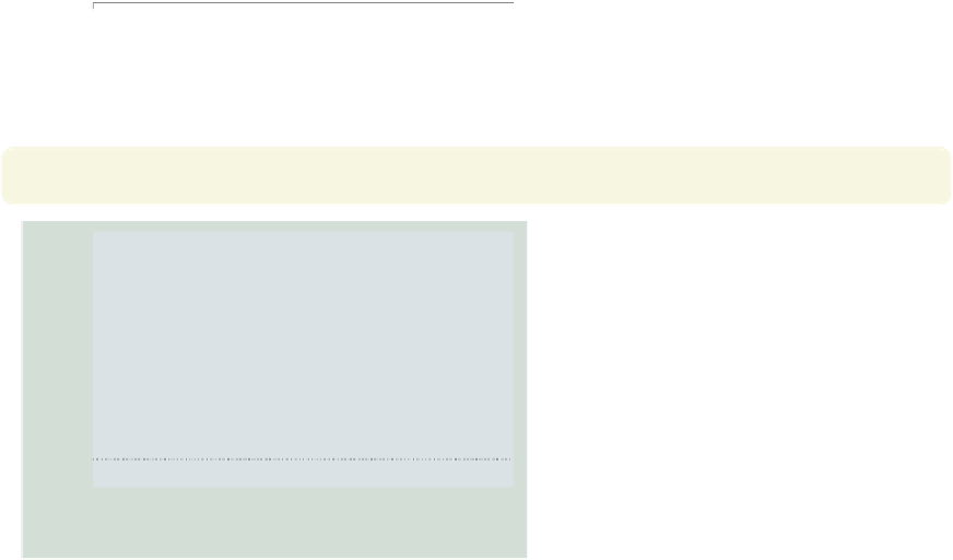
Consider this graph showing the mean
hourly wage broken down by
occupation. We use the
ytitle()
option to add a title to the
Prof
Mgmt
-axis. We
place the title across two lines by using
two separate, quoted strings. See
Options : Axis titles
(254) and
[
G
]
axis title options
for more details,
but please disregard any references to
xtitle()
, since that option is not valid
when using
graph dot
.
Uses nlsw.dta & scheme vg teal
y
Sales
Cler.
Operat.
Labor
Other
0
10
20
30
40
Hours Worked
Per Week
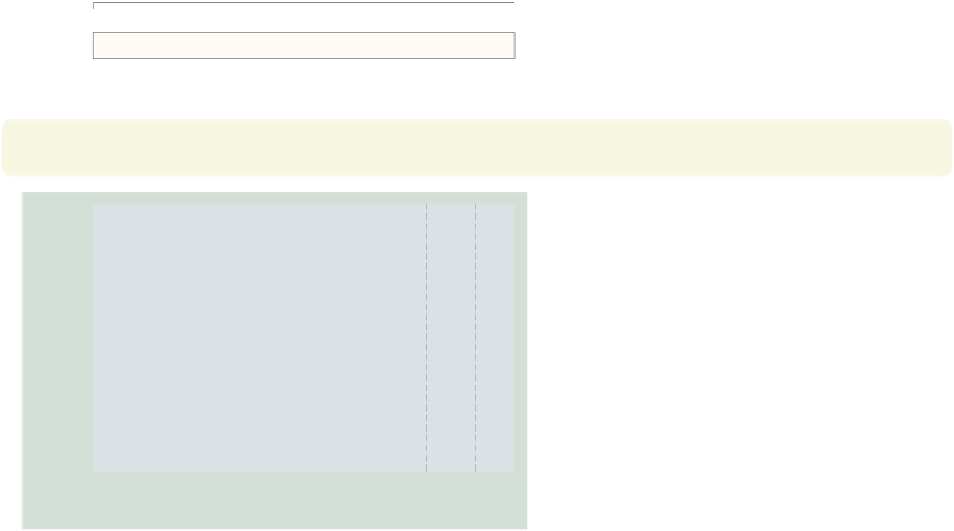
graph dot hours, over(occ7)
ytitle("Hours Worked" "Per Week",
bfcolor(eggshell) box bexpand
)
Because the title is considered to be a
textbox, you can use textbox options as
illustrated here to control the look of
the title. See
Options : Textboxes
(303)
for additional examples of how to use
textbox options to control the display
of text.
Uses nlsw.dta & scheme vg teal
Prof
Mgmt
Sales
Cler.
Operat.
Labor
Other
0
10
20
30
40
Hours Worked
Per Week
graph dot hours, over(occ7)
yline(35 40, lwidth(thin) lcolor(navy) lpattern(dash))
This example uses the
yline()
option
to add a thin, navy, dashed line to the
graph where the hours worked equal 35
and 40.
Uses nlsw.dta & scheme vg teal
Prof
Mgmt
Sales
Cler.
Operat.
Labor
Other
0
10
20
30
40
mean of hours
The electronic form of this topic is solely for direct use at UCLA and only by faculty, students, and staff of UCLA.