Information Technology Reference
In-Depth Information
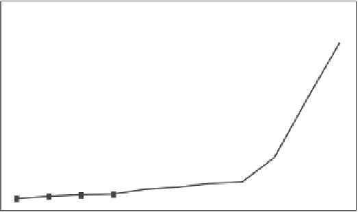
9.5.1 A Typical Performance Response Curve
Starting with an empty test environment, you should launch more and more copies
of the same transaction and watch a predictable pattern of round trip performance
emerge under increasingly higher workload conditions. Figure 9.1 illustrates what
the plot will look like if you keep adding more transactions.
50
40
30
"Knee" of
the curve
20
10
0
1
50
100
150
200
250
300
350
400
450
500
Number of round trip transactions
Figure 9.1
Round trip performance for catalog browse transactions
The
x
-axis is the number of transactions active at the same time. The
y
-axis
is the slowest response time measured for any of the active transactions. Using
either the average response time or the fastest response time for comparison with
the performance requirement will, in effect, mask the worst response times. A
reasonably well-designed transaction process will exhibit linear performance up
to a point, in this case 350 transactions. More than 350 transactions exhibit an
exponential response time. The point at which the trend changes from linear to ex-
ponential is traditionally called the “knee” of the curve. This curve infl ection rep-
resents some kind of bottleneck arising in the transaction process path. The plot
does not tell you the nature of the bottleneck, just the circumstances. Currently,
the only way to discover the location of the knee is to execute the workload and
plot the results.
Yo u r fi rst impression of using the performance curve might be that you
must push your workload till you encounter the knee of the curve, but that may
not be necessary. Consider the plot in Figure 9.2 and our business performance
requirement of 10 seconds maximum per catalog browse for a peak workload of
250 active transactions.
Box A represents the peak workload round trip response time of 250 active
transactions. At 250 transactions, the worst transaction response time was about


Search WWH ::

Custom Search