Graphics Reference
In-Depth Information
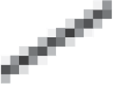
You can see that the line is fairly “jaggy”—it has jagged edges—but it's hard
to imagine how to avoid this if your only choice is to draw a black or a white
square. Fortunately, display devices improved to display multiple gray levels. To
avoid the staircase-like appearance of the jaggy line, we can fill in gray squares at
the steps, or be even more sophisticated—we can set the gray-level for each square
to be proportional to the amount that square overlaps a unit-width line, as shown
in Figure 18.11. The resultant line, viewed close up like this, looks a bit odd. But
seen from an appropriate distance (as in Figure 18.12), it looks very good—far
better than the jaggy black-and-white line.
10
5
0
The “compute the overlap between the square and the thing you're rendering”
approach seems a bit ad hoc, but it also seems to work well in practice. The same
idea, applied to text, produces fonts that are visually more appealing than the pure
black-and-white fonts that arise when we use the “this pixel is black if the pixel
center is within the character” approach (see Figures 18.13 and 18.14).
−5
0
5
10
Figure 18.11: Gray-levels pro-
portionally overlap with a unit-
width line indicated in red.
Merely computing overlaps with pixel squares isn't a cure-all, as you can see
by considering a sequence of images generated by a small moving object. Fig-
ure 18.15 shows a red triangle moving through three pixels of a “one-dimensional
image” in the course of five “frames.” In the first and second frames, it's com-
pletely in the first square, tinting it pink; in the fourth and fifth, it's completely
in the third. In frame three, it's in the middle square. The result is that although
the object is moving with uniform speed through the pixels, it appears to “rush”
through the middle pixel, which is pink for only half as long as the pixels on
either side.
To compensate for the differing amounts of time spent in each square, and thus
the irregularity of the apparent motion, we can use a different strategy: Instead of
measuring the area of the overlap between the object and the square, we can com-
pute a
weighted
area overlap, counting area overlap near the square's center as
more important than area overlap near the edge of the square. While this approach
does
address the irregularity of the pure area-measuring approach, there remains
another problem: As a small, dark object moves from left to right, the total bright-
ness of the image varies. When the object is near the dividing line between two
squares, neither is darkened much at all; when it's near the middle of a square,
that square is darkened substantially. The result is that the object appears to waver
in brightness during the animation.
Figure 18.12: A grayscale ren-
dering of a line, unmagnified.
A line of slope 3
5, drawn in black-and-white, will contain two pixels in one
row, one in the next row, two in the next, and then the pattern will repeat, in a
2, 1, 2, 2, 1, 2,
/
fashion. The irregular “jaggedness” of this line corresponds
precisely to the irregular time spent by the moving triangle in each square—the
jaggedness of the line and the jerkiness of the motion are different instances of
the same aliasing phenomenon.
...
Figure 18.13: A black-and-white
rendering of a letter “A”.
The somewhat surprising solution is to use a weighting function that says that
an object contributes to the brightness of square
i
if it overlaps anywhere from
the center of square
i
1 to the center of square
i
+
1. Figure 18.16 shows this
in a side view. The object, shown as a small, black line segment, contributes both
the left pixel, whose weighting function is shown in blue, and the center pixel,
whose weighting function is shown in red, but not the right pixel, whose weighting
function is shown in green. The left-pixel contribution is small, because the black
−